
About user
Posts by :


Ruler redesign
Ruler Redesign
Inspired by my everyday experience in drawing, my project is a concise and thoroughly examined redesign of a ruler. By slightly change the structure of ruler, the new ruler can prevent people from smudging the image when drawing lines.

Problem
A ruler is an essential tool for drawing lines for technical architectural drawings. However, using rulers to draw lines (especially when applied with pens which are easy to leak such as technical pens)often lead to inky marks and smudged drawings. How can we solve this problem?


Paper deforms, bottom of the ruler touches the ink

The canvas will be smudged when moving the ruler.

The canvas will be smudged when moving the ruler.

Paper doesn’t deform, perpendicular surface of the ruler touches the ink


Hold the pen not vertically to draw more accurate lines, and hold the pen at an angle.
Hold the pen in different angles, and build the 3D model respectively

Summary:
Technical pen, pen, pencil, and ball-pen are shown above. For a technical pen, the ink part is too short that only the ink part will touch the ruler, and will easily smudge the drawing. But for a ball-pen, the tip part in long enough to prevent the ink part to touch the ruler, and thus makes it less possible to smudge the drawing.
Brainstorm


Turn the ruler upside down. Gap under the rule may lead to sight line deviation. Scale is on the upper surface of the ruler, may result in inaccurate reading


No fulcrum at nib, shaky and unstable. Sightline deviation may lead to failure to drawing specific lines.The gap between ruler and paper lead to inaccurate reading.

Concept
Remove the part that will contact ink, and extend the vertical plane for more stable supporting.


Keypoint
When the vertical plane is too short, the pen will shake.
When the vertical plane is too long, it can affect vision and accuracy.


Testing & Modify
Adding transparent tape to change shape of ruler
Testing:
For a more concise study, detailed size changing experiments need to be conducted in <=1mm scale because all the components are tiny and precise. To do so, I plan to change the size little by little by, because it was the best way I tested to change the shape of the ruler while maintaining the readability of the scale.


At last, after the tests, the design shown above can successful prevent the canvas from being smudged when drawing lines with a ruler.
What I learned
Sometimes we do not need high technology to solve the problems in designs. Instead, looking into the problems to find the real reasons and then looking for the most suitable methods to solve them may be more efficient. The design is not only about a concept. The design is also about trying the ideas out. This project about redesigning ruler deepened my understanding of practicing, testing and feasibility study.

Reverse-app
Reverse OS
Simplify the way you interact with mobile apps
Individual project. This is a mobile OS designed to promote a simple lifestyle. People nowadays are glued to their screen too much, which in many ways is unnecessary.
Problem
People are addicted to Mobile apps.
“How to provide an effective way to interact with the smartphone, while retaining the necessary function in daily life. ”
-
The mobile device has played an important part in all aspects of life. As people’s lives have been completely changed, it also raises a serious dependence on mobile devices. People will stare at their phone screen, whether walking on the street, having dinner with friends or visiting the museum. Indeed, in many ways, the mobile phone has brought us convenience. However, people are addicted to the smartphone, while ignoring the reality of life. Therefore, I wanted to design an app, which can potentially:
“Provide an effective way to interact with the smartphone, while retaining the essential function in daily life. ”
Target Users
Who has to deal with complex apps?

Post-Millennials
Age: 1 – 24
- Usually use the smartphone as a game machine or entertainment device.
- Addicted to the smartphone.

Millennials
Age: 24-38
- Like simple lifestyle.
- Less frequently use smart devices.
- Only use a few apps frequently

Other generations
Age: 39 – 75
- Feel difficult to use mobile apps.
- Contact acquaintances.
- Less likely to keep up with new technical devices, but have interests in using a smartphone.
User Research Insights
People are using apps in 2 major ways

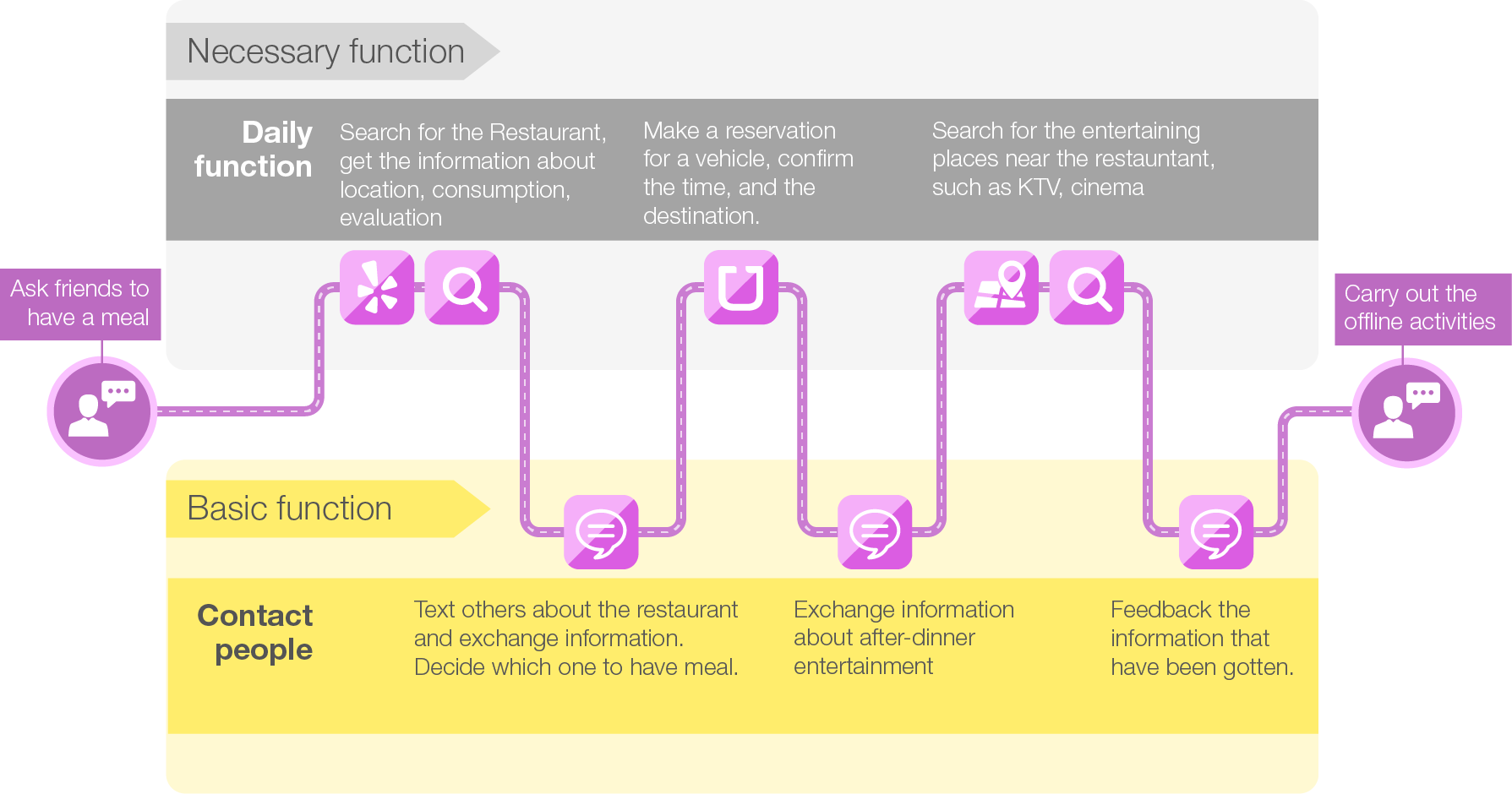
Basic function of mobile phone
Contact other people, send messages, which is the most basic function that people use the mobile phone initially.
Necessary function of mobile phone
For different app functions, the most commonly used functions are separated, in the form of plug-ins to combine with ReverseOS. Complex functions in the apps are stripped off. Those app makers can make a special part of their apps to add to this platform.
Product Design Research
What are pain points in apps?
-
Too many steps make the operation complex and cause an increase in the cost of user-generated content, which has a negative impact on producing content in a platform.
-
No correlation with each other modules let whole app too bloated. In fact the app can be split into several independent apps that are more effective, regardless of commercial consideration.
-
With too many sub menu, photo app has countless toning function to meet people’s different needs, and it will naturally consume more time and confuse users.
-
User interface design is too fancy, which make users confused, and do not know how to use.
-
Many apps push other advertising content and are attached lots of advertising links, which reduce use efficiency of app.
-
In order to increase user stickiness, many apps supply the social function. However, according to the relevant data, users rarely use these social function. Their social needs can be meet on Facebook, twitter,etc.
Product Design Research Insights
Less hierarchy makes more efficiency

Typical Flow Path
Typical app structure is a complex one that has many features and multiple paths, but only few of them are used often.

Ideal Flow Path
Ideal structure is effective, less hierarchical, and each function can be used effectively without redundancy.
Ideation
How to solve the complexity?
A sample user journey of interacting with apps
Brainstormed ideas
“Flow”
Streamlined workflows that consist of a different combination of features of different apps.
“Passive”
Passive information receiver.
“Half Conversational UI”
Conversational UI assisted by GUI.
“Tailored”
Tailor each app and separate apps based on use frequency.
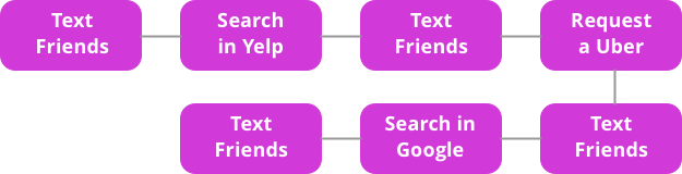
Accomplish a task of hanging out with friends.
Based on the effort users need to make and the overall improvement on efficiency.
“Tailored”
IA & Low-fi


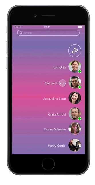
Contacts &
Contextual function
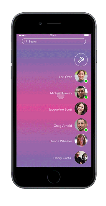
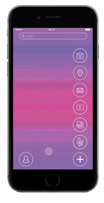
Contacts page
All the contacts are extracted from different message apps when you are texting a person, it is the same experience you will have with other message apps, such as messenger, Whatsapp, etc.
Context-aware functions
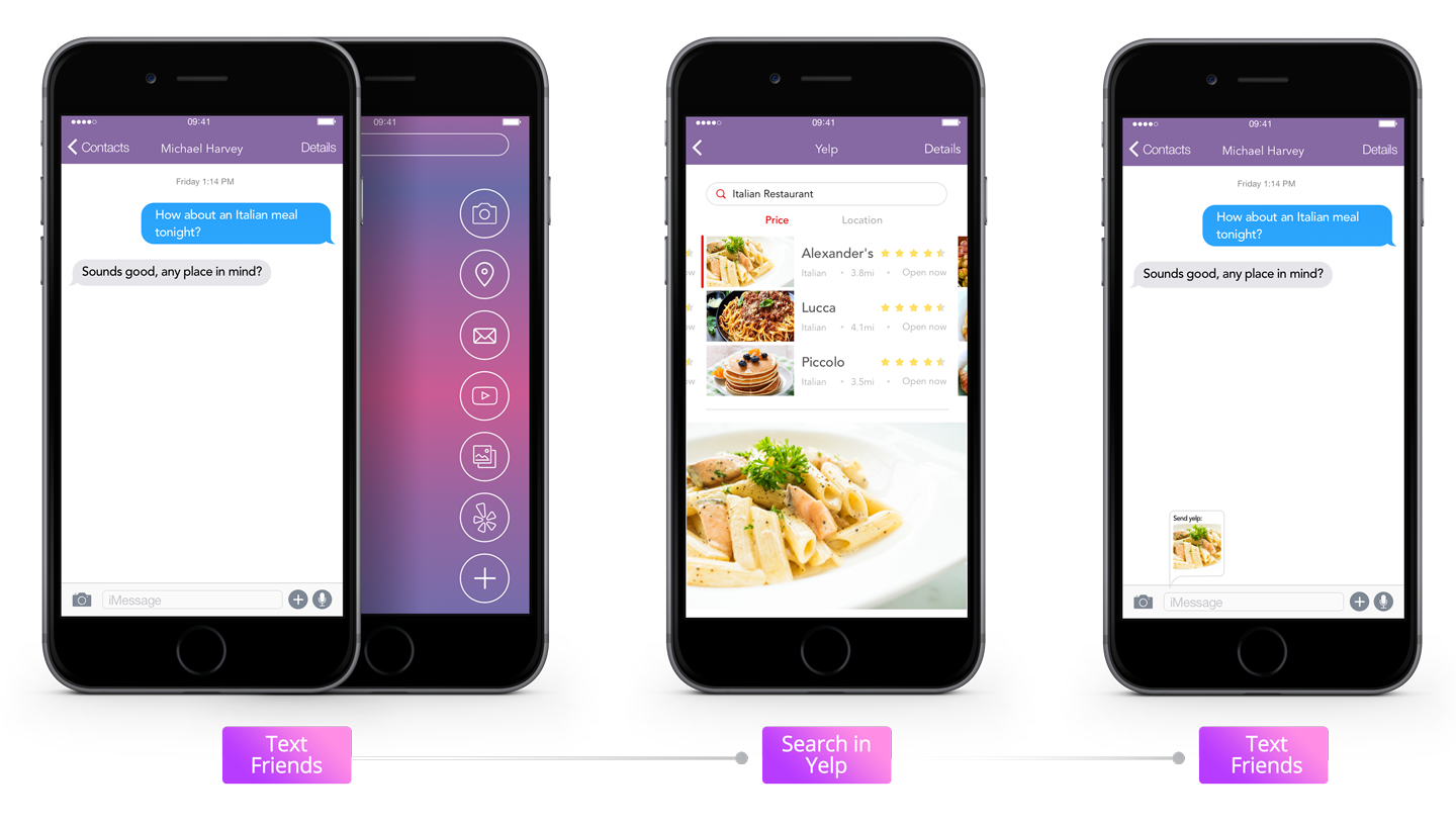
1. Context-aware Function Page
Depending on the context of your text messages, users will get a contextual app list when swiping to the right from the message page.
e.g. when planning a meal, yelp will be on the list of apps.
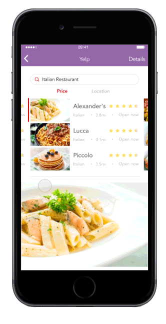
2. Context-tailored feature
Depending on the context of your text messages, users will get a tailored functionality of the app as well.
e.g. When entering yelp, the search research results have been generated and it will only contain features that help choose a restaurant. In addition, the app structure is also flattened.
3. Context-aware message
Depending on the context of your behavior in the function page, users will get suggested content to send when they go back to the message page.
e.g. When going back to the message page, the restaurant information will pop up. The user can send the information by hitting the tiny pop-up window.
Timeline to keep in check
Pull up the timeline page. All the daily events appear in the chronological order, including events happened in daily function and contact events. users can enter the event to check or continue the event.

Reflection and Summary
Started from the concept of providing a simple, efficient way to interact with smart phone, Reverse app form into a simple operation way of flow. Reverse app is more like an operating system than an app. Of course, it is not an appealing solution for those severe phone dependence. But for the elderly, children, and young people who want to use the phone efficiently, it offers an innovative way of interaction.

Modelens
MODELENS
Individual project
3D Model projector
Background
“Find a solution to address the unnecessary model material wastes.”
-
When I was learning Architecture design, it will cost lots of materials to make models. Students consumed the large amount of wood, PVC board, acrylic and other materials, which can never be recycled.
Although some of the models indeed act as assistance in the design process and are highly artistic, most of them are only used as outcomes of assignment and were randomly dropped in the corner of the classroom after the work.
Typical Workflow

Typical workflow and the consumed materials were researched. Theses, together with interviews with professors in the department of architecture, formed the identification of problems and design opportunities.

Research Insights

3D Model
Communication
Design Reply
Renderings
Assignments
Training
Intuition
The 3D model is not intuitive, and there appears to be a large gap between the real effect and the model effect.
Communication
Even though rendering can express the real design effect, the 2D image does not show all angles of the model, which is not convenient for communication.
Historical Reasons
There is no computer for many teachers when they are in their school age, and making handmade model was also used as a way to train skills. Therefore, the mockups have become an important tradition Architectural Education.
Ritual
psychologically, more importantly, making models is a ritual. After completing the work, students need to show their designs, and we need an object placed in front of everyone. This is a more accessible way.
Brainstorm

Physical needs
Observe model from every angle& Real vision of the final building results&Model-like appearance
Psychological needs
Sense of ritual&Communicate with others&Form new acceptable habit
Other needs
Technical feasibility&Economical
Concept

Projection Plane
Holder

Limited by technical conditions, I finally decided to design a model-like machine. A rendered 3D model can be projected in the machine like a real-time entity model, and presenter can interact with the model through gestures.

PROTOTYPE
It’s not the real 3D holograph cannot be projected with an optical instrument in the shape of a slope. It’s a device easier to present a rounded rotating 2d image to a mono camera and call it holograph. By project the image into the projection plane via IPad( on the top of the device), it shows a realistic effect. In the field of vision, we can observe the different models and interact with model.


Scenario of Discussion

Scenario of presentation


MODELENS
The device meets the needs of rituality, and with its model-like shape, it would not like a flat 3D model in the computer. Meanwhile, its interactive features can display the model under the scenario of discussion and presentation, release students from heavy work of making mockup and reduce material wastes. The design is very simple, can be folded conveniently and only requires IPad as a projection devices, which is economical and portable.
Before

After

Benefits
Reduce material wastes
Less time consuming
Simpler workflow
Intuitive interaction
Richer ways of presenting design result